
Calendar Section Design Audit
Context
Onboard describes itself simply as board meeting software. It allows people on boards to meet, take
notes,
vote on important issues, schedule meetings, and much more. I was asked to complete a product design
audit
on the calendar section of Onboard based on a few problems the software had gotten feedback about.
Before I
started working on this project, I didn't realize board meetings would have different needs outside
of
Zoom,
Teams, or Slack. As it should, empathizing with the users became my main focus.
4 Product Design Takeaways
1. Importance of Labeling
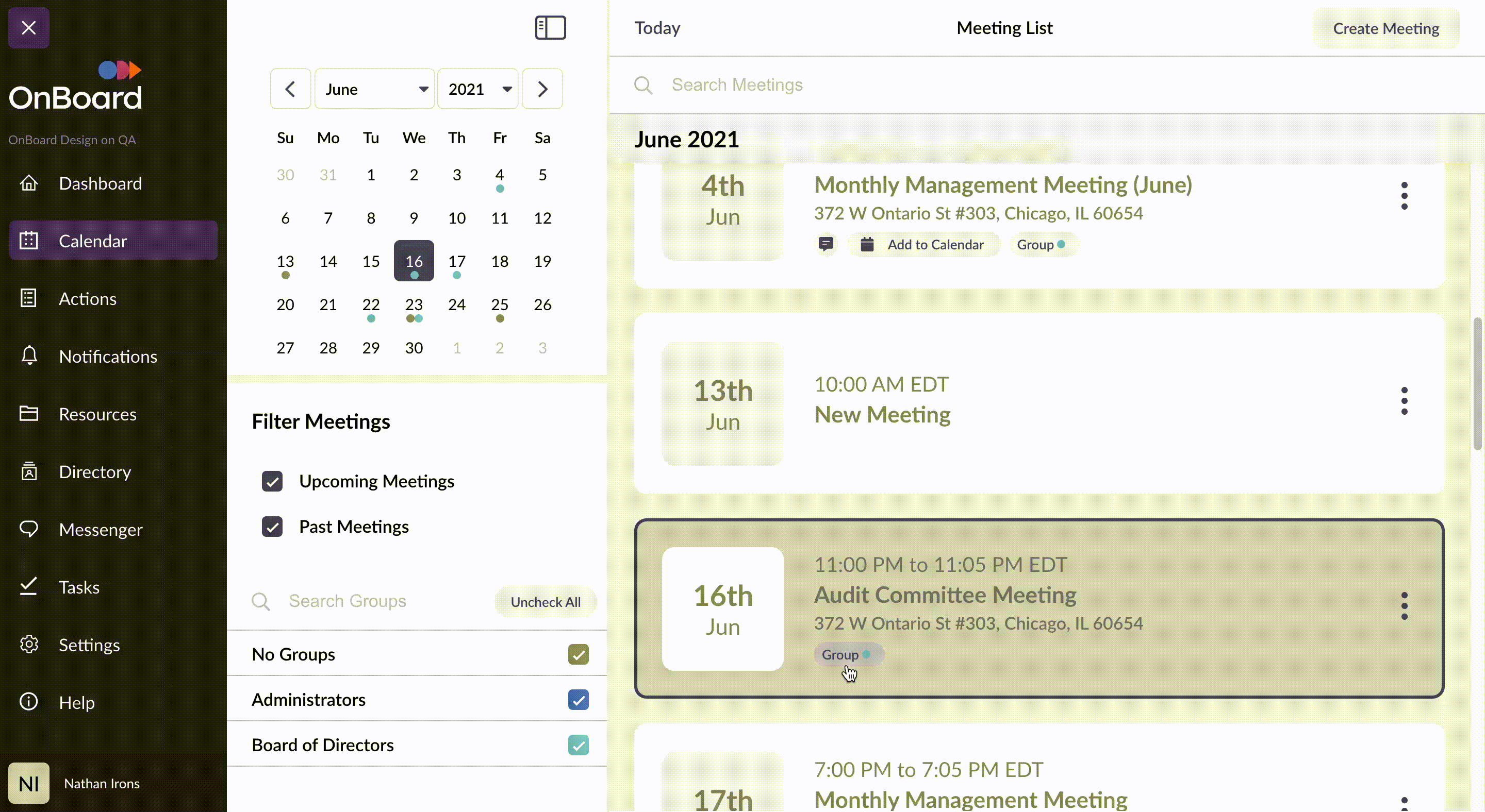
When I first clicked on the section labeled "Calendar", I was expecting some representation of a
calendar with meetings. Yes, there was a calendar, but a very small one solely for clicking on
dates.
The page didn't represent this at all. It was confusing at first since it was really a list
of past and future meetings, but easy enough to understand what was going on after looking around
for a
bit.
Solution: Simply labeling this section "Meetings" could prevent
that
immediate confusion. This would give the user the expectation of landing on a list of meetings
rather than expecting to see a calendar.
2. Help Users Think Less
When the Calendar view first loads, the next upcoming meeting that I was looking for was
at
the bottom of the screen. Typically, that is the last thing a user looks at. Having the meetings in
a
list, a user would be expecting their action item to be at the top or middle of the screen, but not
the
bottom.
Solution: The next upcoming meeting should be displayed at the
top of
the
screen on load so it is the first thing a user sees. This would provide better UX by reducing
the
amount of time it takes for a user to find what they're looking for.
3. Cognitive Overload
Right away, there is a lot of information calling for my attention. There is a sidebar navigation
menu
and another sidebar menu with filters and a calendar stacked outside of that. All of this, along
with
the main list of meetings.
Solution: The calendar and filters don't need to be open on load
view. If a user is searching for more detail, they are asking for more cognitive load.
Therefore,
making a user click on the open button is a great action for them to have to take because they
are
looking for more information.
4. Disorienting Scroll
I decided to click on a past date that was one month back to look for a meeting that has some
historical
documentation and was confused after I clicked. There was no movement on the screen. The date I
selected
appeared with no clue to how it got there. This may seem like it isn't an issue, but can be
disorienting
for some users.
Solution: A simple solution is to implement smooth scrolling
after clicking to
give
the user context
of which direction they are going, either up (past meetings) or down (future meetings).