Case Study

Redesigning the Student Activity Experience

Tagline

Helping young students find, start, and complete activities independently, while reducing teacher support burden.

Project Overview

Role

Product Designer

Timeline

2 Months

WHAT I DID

  • Experience audit and journey mapping
  • User research and usability testing
  • Interaction and visual design
  • Prototyping and validation
  • Cross-functional alignment on tradeoffs

Tools

  • Figma
  • UserInterviews
  • Lyssna
  • Chameleon.io
  • ChatGPT

Problem

Young students struggled to find, start, and complete activities on their own. Many students submitted an activity after finishing the first page, not realizing there were more to complete. This required one-on-one teacher support, reducing instructional time. When students could not navigate activities independently, teachers lost trust in the experience. This increased frustration, support burden, and the risk of classroom-level churn.

User Goals

  • Reduce teacher support time during activities.
  • Increase completion of multi-page activities.
  • Reduce student-related support requests.

Constraints

  • No additional setup or workflow changes for teachers.
  • Must work across laptops, tablets, and phones.
  • Must scale beyond K–2 classrooms.

Project Design Principles

  1. Remove anything that does not directly support the task.

    • Fewer choices help young students focus and act with confidence, reducing cognitive load.
  2. Design for independent progress, with clear recovery when mistakes happen.

    • Students should be able to move forward without help, and easily understand how to fix issues if they get stuck.

Existing Experience and Failure Points

Starting activities

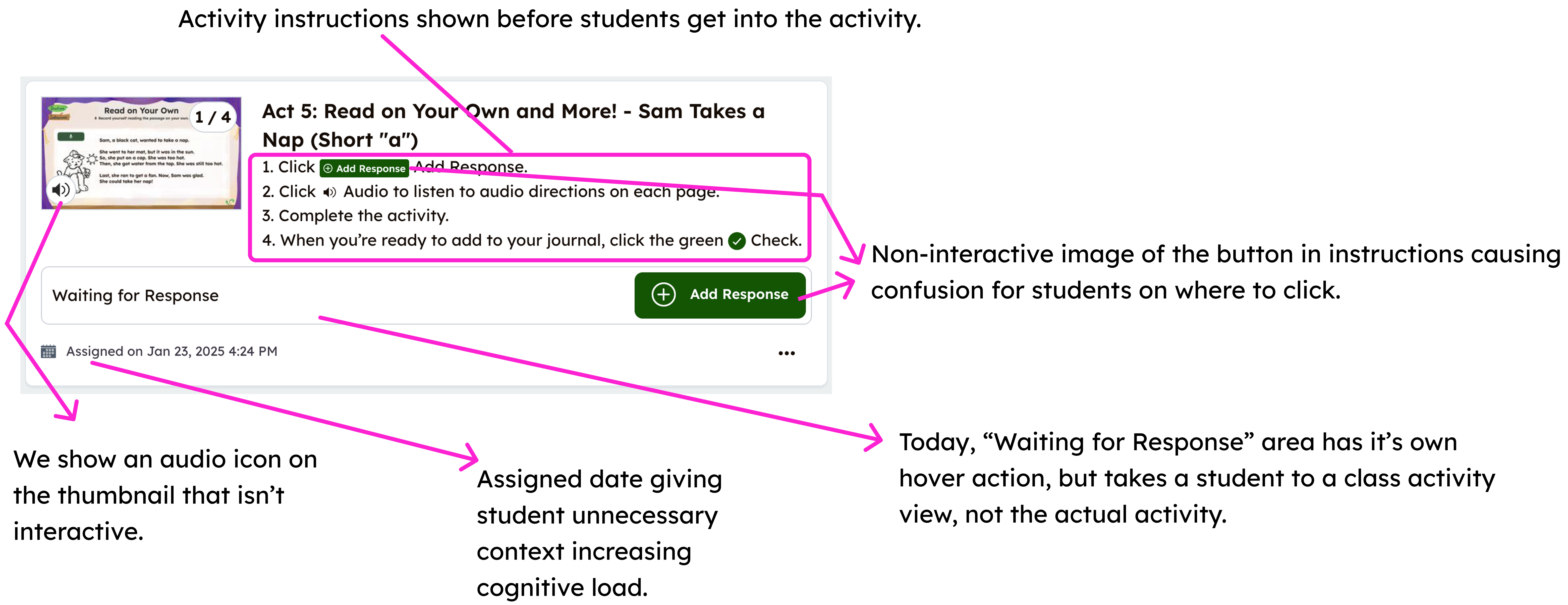
  • Activity cards had multiple click paths, but only one started the activity.
  • Students often clicked the title, description, or teacher’s name and ended up somewhere unexpected.
  • The “Add Response” button was buried and difficult to find on touch devices.

Before: Activity card layout

Completing activities

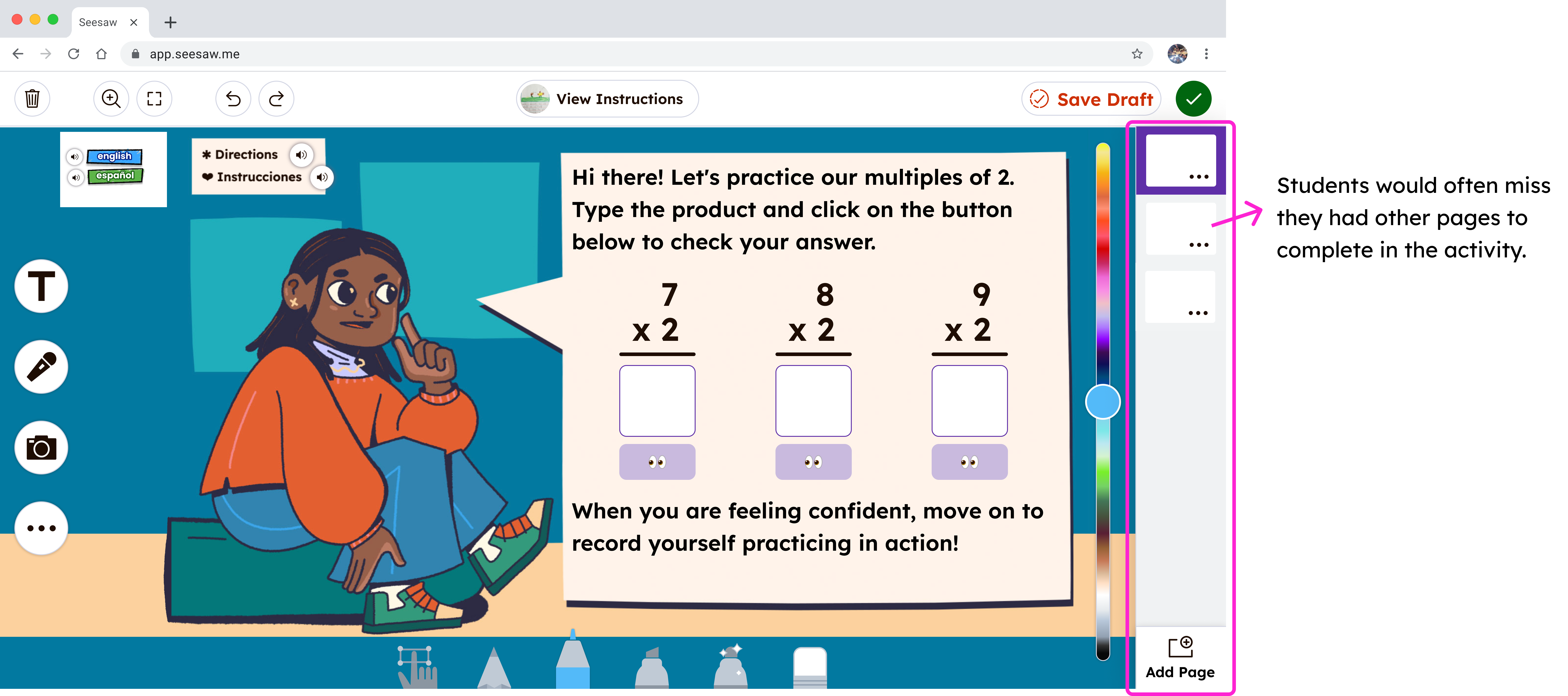
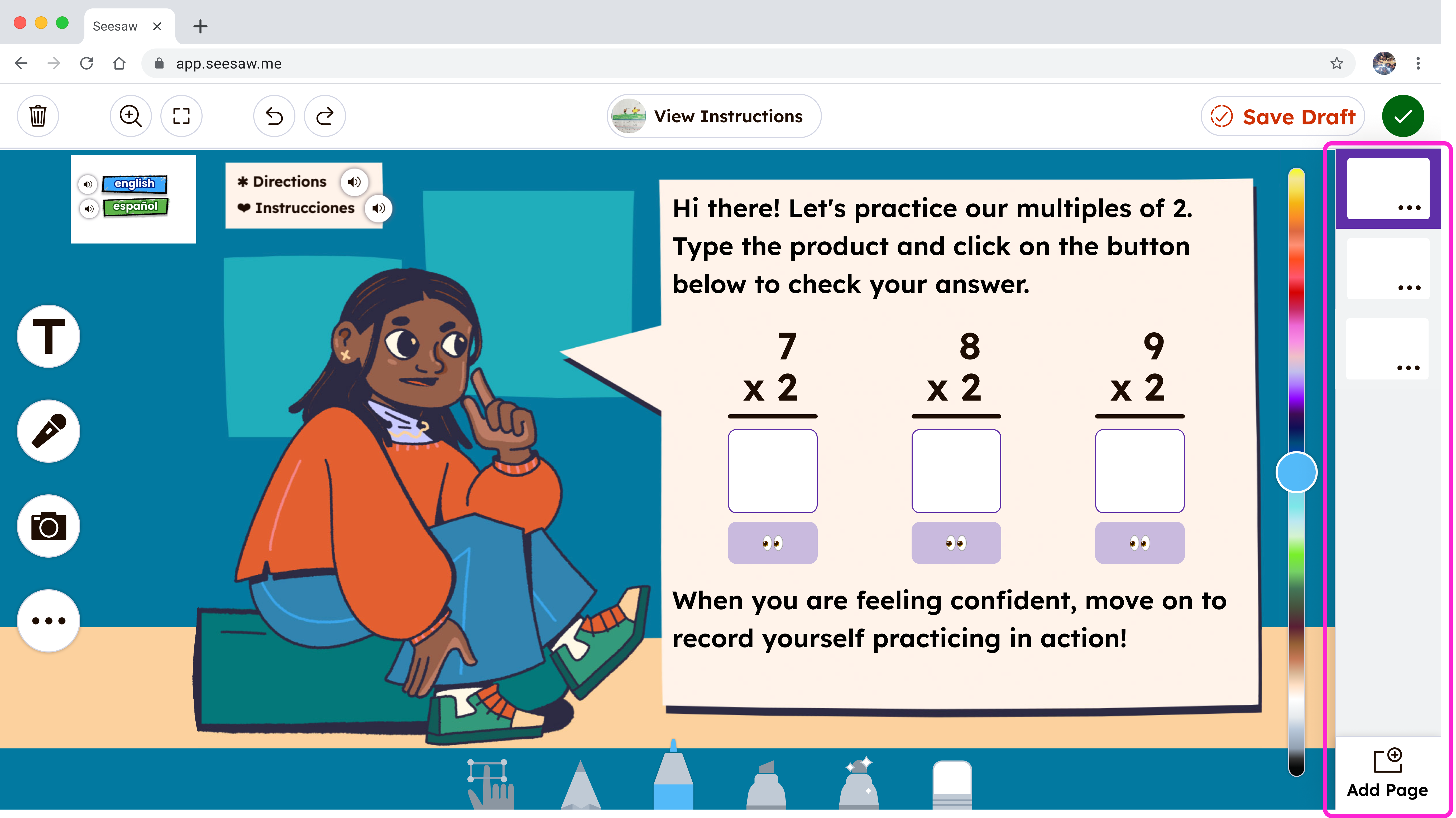
  • Students frequently finished the first page and missed additional pages.
  • Many submitted work early without completing all required steps.

Before: Filmstrip navigation

Evidence

  • In-classroom observations showed students struggling to work independently.
  • In moderated usability testing, 9 of 12 students did not navigate to multiple pages.

The Designs: What Changed and Why

Simplified Activity Cards

What changed

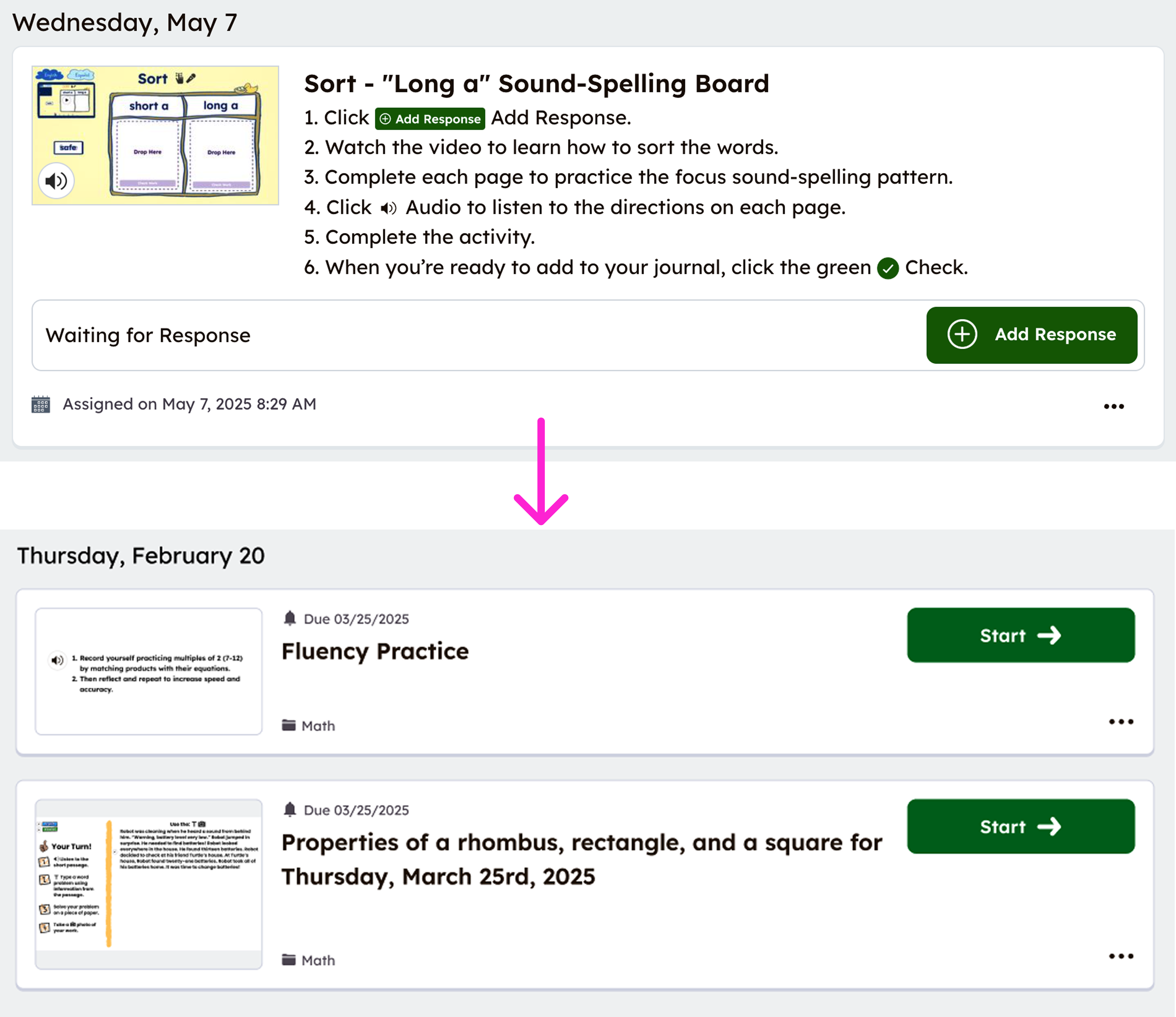
  • Reduced cards to essential information.
  • Added two clear ways to start: a large thumbnail and a prominent “Start” button.
  • Removed all non-starting click paths.

Why it mattered

Students needed a single, predictable way to begin without thinking.

Before and after activity cards

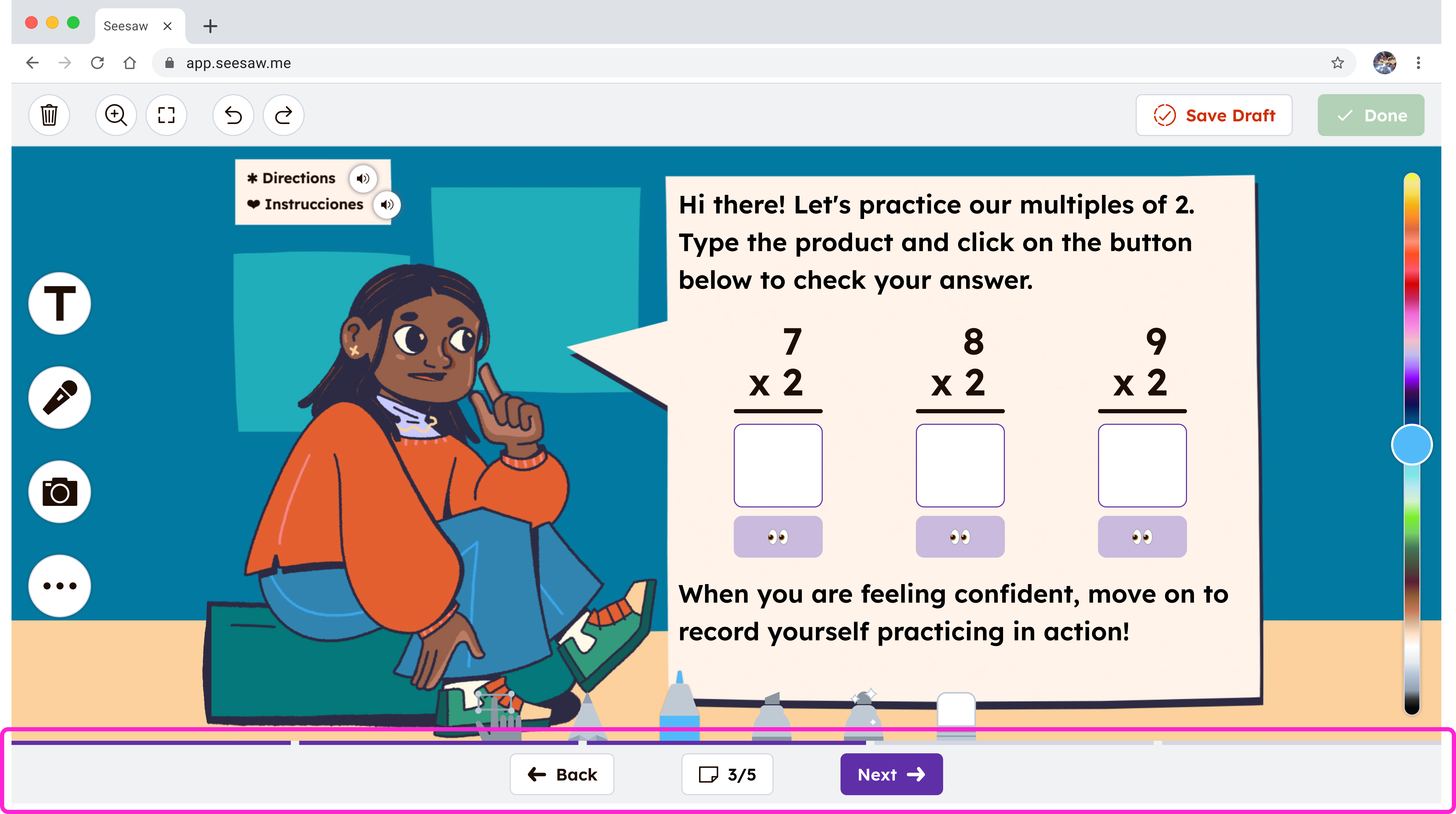
Bottom Navigation Buttons

What changed

  • Added large, fixed “Next” and “Back” buttons at the bottom center of every page.
  • Kept navigation consistent across devices.
  • Added “Page X of Y” indicators.
  • Introduced a segmented progress bar.

Why it mattered

Bottom-center placement works across tablets and laptops, minimizes accidental taps, and reinforces linear progression. Students also needed clear signals that more work remained and how far along they were.

Bottom navigation buttons

Flexible Navigation for Advanced Use Cases

What changed

  • Preserved filmstrip navigation through a secondary menu.

Why it mattered

Some teachers design non-linear activities. Flexibility was maintained without overwhelming the default experience.

Secondary filmstrip navigation

Smart Prevention at Submission

What changed

  • Added checks for skipped pages at submission.
  • Guided students directly to incomplete work.

Why it mattered

Prevented incomplete submissions and reduced teacher follow-up.

Submission recovery state

Validation

We validated the redesign through usability testing and post-launch signals. In unmoderated usability testing, 7 out of 7 K–2 students successfully started an activity, navigated through all pages, and submitted their work without assistance. These results carried into real classrooms. Teachers reported fewer early submissions and fewer interruptions during class, and we saw a reduction in student-related support tickets after launch.

3 out of 12 students successfully completed an activity.

7 out of 7 students successfully completed an activity.

Impact and Outcomes

Student behavior

  • Fewer early submissions reported by teachers.
  • Improved completion of multi-page activities.

Teacher impact

  • Less time spent on technical support.
  • More time spent on instruction and learning.

Support and business signals

  • Reduction in student-related support tickets.
  • Positive qualitative feedback from teachers.

Tradeoffs and Constraints

  • Optimized for linear progression based on activity data, while still supporting page jumping.
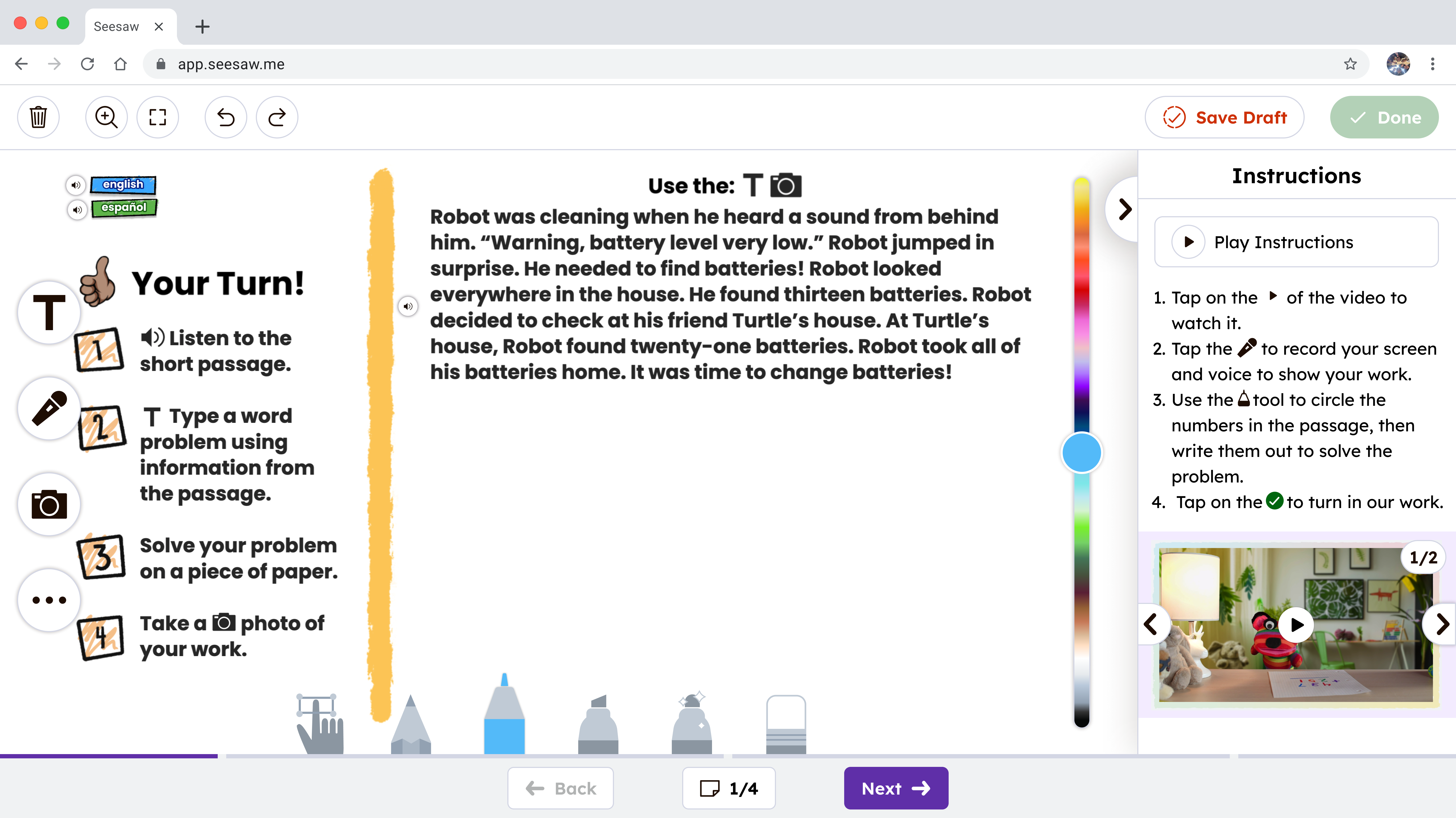
  • Instructions previously lived behind a modal and were often missed.
  • A fully contextual instruction pattern required significant technical investment.
  • For v1, instructions were placed on the first activity page to ensure visibility and validate behavior.
  • Deprioritized showing page “types” to avoid unnecessary complexity.

What I learned and What I Would Do Next

Watching real user behavior surfaced issues that feedback alone did not. Small usability problems compound quickly in classrooms, affecting learning time for students and trust for teachers every day.

  • Explore ways to keep instructions visible without causing change blindness.
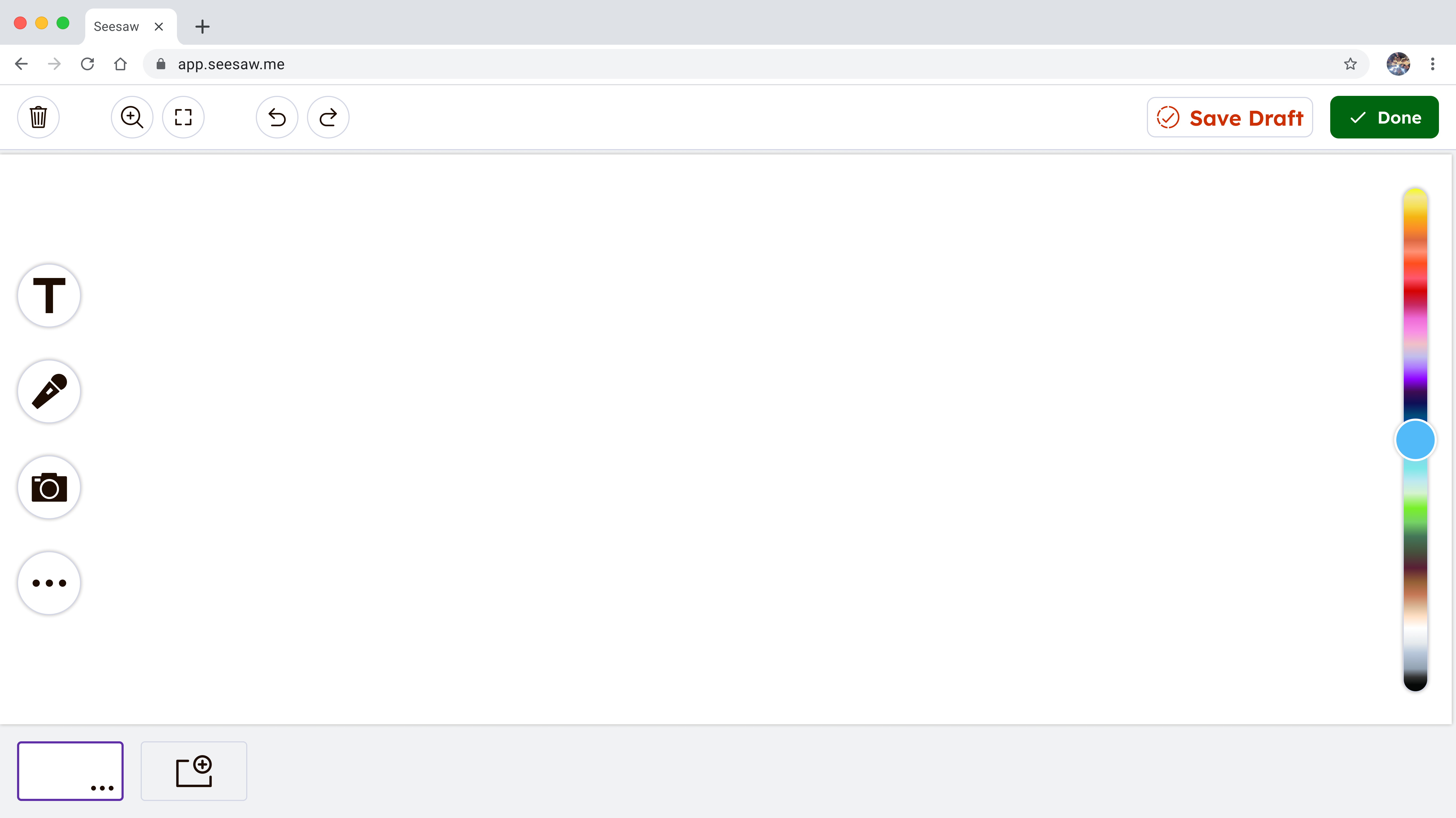
  • Extend bottom navigation to student-created posts to create consistency across the system.

Updated instructions UX to prevent change blindness

System-level navigation consistency for student-created posts

Next Case Study

Onboard — Design Audit (2021)